If you’re trying to break into data analytics without any relevant paid experience, you’ve probably heard the advice to “do projects.” But what makes a good project? What is going to impress a hiring manager?
There are a few things to keep in mind when doing a project:
- Demonstrate the skills necessary for the job you want
- Prove that you can answer relevant questions with data
- Make sure what you do is easy to understand
But what does that actually look like?
Demonstrate the right skills
If a hiring manager is looking for a candidate who has skills in SQL and Tableau, then only having Python projects isn’t going to signal that you have the skills they’re looking for.
Spend some time looking at the job descriptions for the jobs you want. What skills are they asking for the most? Those are the skills that you want to demonstrate in your portfolio.
Now, you might find that different companies want different skills for the same job title. If you’re targeting Data Analyst roles, you might find some mix of:
- Excel
- SQL
- Tableau, Power BI, or Looker
- Python or R
- Industry-specific tools like Salesforce, Amplitude, Google Analytics, etc
- Cloud-based tools like AWS or Azure
- Statistical analysis, regression, hypothesis testing, predictive modeling
This is why it’s important to look at the jobs that are the most relevant to you and to identify patterns. After all, this is what a Data Analyst does! Finds patterns in messy information. Consider this an analysis task.
Another question — should you do a separate project for each skill or should you combine all of your skills into one project?
The right answer is to do what makes sense for your project. That is what you’ll do on the job — identify the right tool or tools to solve the problem. Sometimes you’ll work in SQL + Excel. Or SQL + Tableau. Or just in Python. Or just Excel. Etc.
Prove that you can answer relevant questions with data
One common mistake among junior folks is they think any data analysis or visualization is good.
It isn’t.
You want to make sure you’re providing an analysis that actually tells a story and solves a problem.
“Vanity metrics” is a common term in this field. This is something that might look impressive but doesn’t actually answer any useful questions or provide any actionable insights.
A very common one in marketing or product analytics is the number of visits or users or customers. It might be a big impressive number.
But what does it tell us? Is that what we truly care about?
Marketing and product analytics typically care much more about conversion metrics — how many of them actually did something valuable?
Often “valuable” means giving us money or information.
What percent of users or visits …
- Placed an order
- Made a donation
- Signed up for a membership
- Signed up for an email or contact list
- Downloaded the mobile app
- Etc
Other useful metric are rate-based …
- What is the average value of orders?
- How many items per order?
- How often does this user return to place another order?
- What is the lifetime value of a new customer?
- How long do users stay members (and presumably pay a membership fee) versus how many churn (leave/quit/cancel)?
- How many email subscribers or mobile app users eventually place an order or become paid members?
- Etc
And then compare all of the above (conversion and rate-based metrics) by various categories and demographics to see where to find more value.
Make sure it’s easy to understand
Another common mistake I see among junior folks is trying to cram in too much information and also using visuals that aren’t great.
Before you start creating visuals or even digging into the data, think about the problem you’re trying to solve. Think about the questions your audience would ask. Think about the decisions they will make from your analysis.
And make sure your output is geared towards all of that, especially the last part — what decisions or actions will they take from your work?
Your dashboard can have multiple tabs — you don’t need to shove every visual into one tab. Or if you’re summarizing in PowerPoint, have one idea/question per slide.
- Separate your visuals by categories or the question they answer or some other commonality.
- Don’t have more than one visual to communicate the same thing — pick the best visual.
- Focus on what answers an important question, don’t just visualize every single data point you can.
Also picking the right visuals is important. Like it or not, the “basics” are best — bar charts, scatterplots, line plots are usually the best to convey an idea.
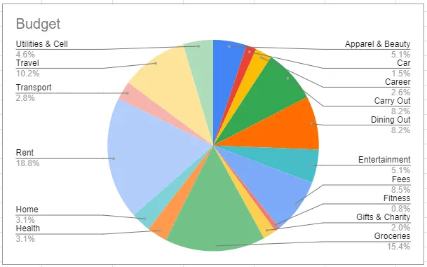
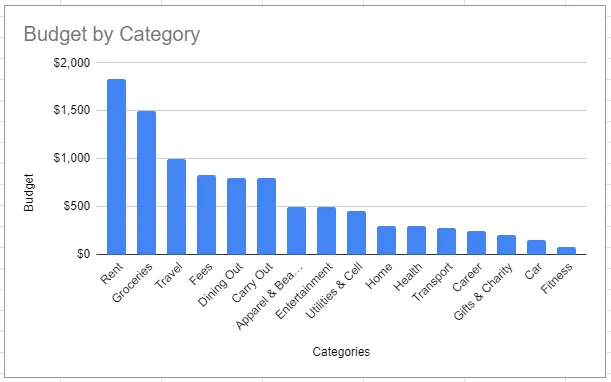
Pie charts, bubble charts, and tree maps are rarely a good idea. The human eye has a hard time deciphering the size in those visuals — a sorted bar chart is usually easier to comprehend.
Which visual below most quickly conveys how this budget is allocated? Can you quickly tell what the most is spent on? The least?
Also think about what you’re putting in the X-axis, Y-axis, how you’re ordering your axes, if you’re using dual-axes, the scale of your axes, how you’re using color, labels, etc.
- It might look cool to cram multiple data points into one visual — but is it easy to understand?
- If you’re using a dual axis, it is clear which is which? Do you need to put both of these data points into one visual?
- If your X-axis is categorical — how are you sorting it? What makes the most sense? Sorting quantitatively usually tells a better story than sorting alphabetically.
- Are your labels legible? Does your audience know what each label means or represents?
- If you’re using color, is it distinguishable? Keep color blindness in mind.
- Do the colors make sense? “Green” usually means good and “red” usually means bad.
- Don’t use color just for the sake of using color if it doesn’t represent anything.
(Someday I’ll do a whole series on good versus bad visuals — in the meantime, I’m starting to cover this more in my newsletter.)
Summarize your work
I see a lot of portfolio projects where someone created a dashboard or did some analysis and visuals in a Python notebook … but so what? What are the takeaways? What did you learn? What kind of impact could your work have?
Once you get a job, the most important part of your projects isn’t all the technical stuff.
It’s the “so what?” part.
Usually, this is conveyed during a presentation which is accompanied by PowerPoint slides. If you’re doing a portfolio project, you can create a PowerPoint summarizing your work, save it as a PDF, and upload it to a GitHub repo. Or Google Drive. Or you can use your README file in GitHub for that purpose. Or you can also write up a blog post about it.
But either way, that is what is most valuable. The summary. The insights. The recommendations.
Some things to keep in mind:
You need to tell a story. You want to include some combination of the following, depending on the project you might not need all of these:
- What is the problem I’m trying to solve?
- What is the goal? What is the output we want at the end? Are there any tradeoffs?
- What are the use cases for that output? How will the business use it?
- What is my methodology? (The data and techniques used.)
- What are the key insights from data exploration and visualization? (You don’t have to include every visual that you create — pick the ones that are the most insightful.)
- What are my recommendations? (What do you expect someone to do with this information? What business decisions should they make? Don’t assume that it’s obvious.)
- What are the next steps? (If you had more time, or if there is a phase 2, what comes next? Where does the project go from here?)
Usually, you’ll have a few different versions of your presentation — the long version when you are blessed with enough time to go through all of the above, and the Executive Summary, when you only have 2–5 minutes to present to leadership. You can create a PowerPoint deck for the long version, and upload or link to that, but use the Executive Summary in your GitHub README or at the top of your blog post.
Want some examples of good projects? Check out the Winning Projects from the DataConnect Data Visualization Contest.
Share more resources in the comments!
Need more help?
Check out my post on the steps for doing a data project, or free resources for datasets, or book time with me if you’d like feedback on your project or portfolio.
Want more career advice? Follow me on TikTok, Instagram, or LinkedIn, and sign up for my free data career newsletter.