Kami di Catatan Alfha menghargai privasi Anda dan berkomitmen untuk melindungi informasi pribadi Anda. Kebijakan Privasi ini menjelaskan jenis informasi yang kami kumpulkan, bagaimana kami menggunakannya, dan langkah-langkah yang kami ambil untuk menjaga keamanan informasi Anda.
1. Informasi yang Kami Kumpulkan
Kami mengumpulkan berbagai jenis informasi untuk berbagai tujuan guna menyediakan dan meningkatkan layanan kami kepada Anda.
a. Informasi Pribadi
Saat menggunakan situs kami, kami dapat meminta Anda untuk memberikan informasi yang dapat digunakan untuk menghubungi atau mengidentifikasi Anda ("Informasi Pribadi"). Informasi pribadi dapat mencakup, tetapi tidak terbatas pada:
Nama
Alamat email
Nomor telepon
Informasi lainnya yang Anda berikan secara sukarela
b. Data Penggunaan
Kami juga dapat mengumpulkan informasi tentang bagaimana layanan kami diakses dan digunakan ("Data Penggunaan"). Data Penggunaan ini dapat mencakup informasi seperti alamat Protokol Internet komputer Anda (misalnya alamat IP), jenis browser, versi browser, halaman situs kami yang Anda kunjungi, waktu dan tanggal kunjungan Anda, waktu yang dihabiskan di halaman tersebut, pengenal perangkat unik, dan data diagnostik lainnya.
2. Penggunaan Informasi
Informasi yang kami kumpulkan digunakan untuk berbagai tujuan:
Untuk menyediakan dan memelihara layanan kami
Untuk memberi tahu Anda tentang perubahan pada layanan kami
Untuk memungkinkan Anda berpartisipasi dalam fitur interaktif layanan kami ketika Anda memilih untuk melakukannya
Untuk memberikan dukungan dan layanan pelanggan
Untuk memberikan analisis atau informasi berharga agar kami dapat meningkatkan layanan
Untuk memantau penggunaan layanan kami
Untuk mendeteksi, mencegah, dan mengatasi masalah teknis
3. Pengungkapan Informasi
Kami tidak akan menjual, menyewakan, atau memperdagangkan informasi pribadi Anda kepada pihak ketiga tanpa persetujuan Anda, kecuali untuk kepentingan berikut:
Mematuhi kewajiban hukum
Melindungi dan mempertahankan hak atau properti kami
Mencegah atau menyelidiki kemungkinan pelanggaran terkait layanan
Melindungi keamanan pribadi pengguna layanan atau publik
Melindungi dari tanggung jawab hukum
4. Keamanan Informasi
Keamanan informasi Anda adalah prioritas kami. Kami menggunakan berbagai langkah keamanan teknis, fisik, dan administratif untuk melindungi informasi pribadi Anda dari akses, penggunaan, atau pengungkapan yang tidak sah. Namun, perlu diingat bahwa tidak ada metode transmisi melalui internet atau metode penyimpanan elektronik yang 100% aman.
5. Tautan ke Situs Lain
Layanan kami mungkin berisi tautan ke situs lain yang tidak dioperasikan oleh kami. Jika Anda mengklik tautan pihak ketiga, Anda akan diarahkan ke situs pihak ketiga tersebut. Kami sangat menyarankan Anda untuk meninjau Kebijakan Privasi dari setiap situs yang Anda kunjungi. Kami tidak memiliki kendali atas dan tidak bertanggung jawab atas konten, kebijakan privasi, atau praktik dari situs atau layanan pihak ketiga mana pun.
6. Perubahan Kebijakan Privasi Ini
Kami dapat memperbarui Kebijakan Privasi kami dari waktu ke waktu. Kami akan memberi tahu Anda tentang perubahan apa pun dengan memposting Kebijakan Privasi baru di halaman ini. Anda disarankan untuk meninjau Kebijakan Privasi ini secara berkala untuk mengetahui perubahan apa pun. Perubahan pada Kebijakan Privasi ini berlaku efektif saat diposting di halaman ini.
7. Hubungi Kami
Jika Anda memiliki pertanyaan tentang Kebijakan Privasi ini, silakan hubungi kami:
Melalui email: nugrahanagi@gmail.com
Melalui formulir kontak di situs kami: alfharizkyfauzi.blogspot.com
Terima kasih telah mengunjungi Catatan Alfha. Privasi Anda penting bagi kami, dan kami berkomitmen untuk melindungi informasi pribadi Anda.
If you’re trying to break into data analytics without any relevant paid experience, you’ve probably heard the advice to “do projects.” But what makes a good project? What is going to impress a hiring manager?
There are a few things to keep in mind when doing a project:
Demonstrate the skills necessary for the job you want
Prove that you can answer relevant questions with data
Make sure what you do is easy to understand
But what does that actually look like?
Demonstrate the right skills
If a hiring manager is looking for a candidate who has skills in SQL and Tableau, then only having Python projects isn’t going to signal that you have the skills they’re looking for.
Spend some time looking at the job descriptions for the jobs you want. What skills are they asking for the most? Those are the skills that you want to demonstrate in your portfolio.
Now, you might find that different companies want different skills for the same job title. If you’re targeting Data Analyst roles, you might find some mix of:
Excel
SQL
Tableau, Power BI, or Looker
Python or R
Industry-specific tools like Salesforce, Amplitude, Google Analytics, etc
This is why it’s important to look at the jobs that are the most relevant to you and to identify patterns. After all, this is what a Data Analyst does! Finds patterns in messy information. Consider this an analysis task.
Another question — should you do a separate project for each skill or should you combine all of your skills into one project?
The right answer is to do what makes sense for your project. That is what you’ll do on the job — identify the right tool or tools to solve the problem. Sometimes you’ll work in SQL + Excel. Or SQL + Tableau. Or just in Python. Or just Excel. Etc.
Prove that you can answer relevant questions with data
One common mistake among junior folks is they think any data analysis or visualization is good.
It isn’t.
You want to make sure you’re providing an analysis that actually tells a story and solves a problem.
“Vanity metrics” is a common term in this field. This is something that might look impressive but doesn’t actually answer any useful questions or provide any actionable insights.
A very common one in marketing or product analytics is the number of visits or users or customers. It might be a big impressive number.
But what does it tell us? Is that what we truly care about?
Marketing and product analytics typically care much more about conversion metrics — how many of them actually did something valuable?
Often “valuable” means giving us money or information.
What percent of users or visits …
Placed an order
Made a donation
Signed up for a membership
Signed up for an email or contact list
Downloaded the mobile app
Etc
Other useful metric are rate-based …
What is the average value of orders?
How many items per order?
How often does this user return to place another order?
What is the lifetime value of a new customer?
How long do users stay members (and presumably pay a membership fee) versus how many churn (leave/quit/cancel)?
How many email subscribers or mobile app users eventually place an order or become paid members?
Etc
And then compare all of the above (conversion and rate-based metrics) by various categories and demographics to see where to find more value.
Make sure it’s easy to understand
Another common mistake I see among junior folks is trying to cram in too much information and also using visuals that aren’t great.
Before you start creating visuals or even digging into the data, think about the problem you’re trying to solve. Think about the questions your audience would ask. Think about the decisions they will make from your analysis.
And make sure your output is geared towards all of that, especially the last part — what decisions or actions will they take from your work?
Your dashboard can have multiple tabs — you don’t need to shove every visual into one tab. Or if you’re summarizing in PowerPoint, have one idea/question per slide.
Separate your visuals by categories or the question they answer or some other commonality.
Don’t have more than one visual to communicate the same thing — pick the best visual.
Focus on what answers an important question, don’t just visualize every single data point you can.
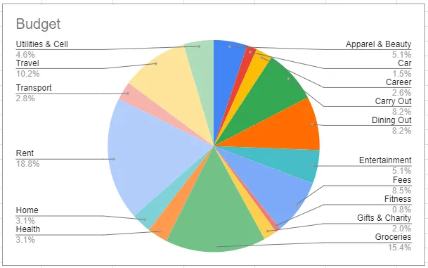
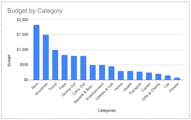
Also picking the right visuals is important. Like it or not, the “basics” are best — bar charts, scatterplots, line plots are usually the best to convey an idea.
Pie charts, bubble charts, and tree maps are rarely a good idea. The human eye has a hard time deciphering the size in those visuals — a sorted bar chart is usually easier to comprehend.
Which visual below most quickly conveys how this budget is allocated? Can you quickly tell what the most is spent on? The least?
Also think about what you’re putting in the X-axis, Y-axis, how you’re ordering your axes, if you’re using dual-axes, the scale of your axes, how you’re using color, labels, etc.
It might look cool to cram multiple data points into one visual — but is it easy to understand?
If you’re using a dual axis, it is clear which is which? Do you need to put both of these data points into one visual?
If your X-axis is categorical — how are you sorting it? What makes the most sense? Sorting quantitatively usually tells a better story than sorting alphabetically.
Are your labels legible? Does your audience know what each label means or represents?
If you’re using color, is it distinguishable? Keep color blindness in mind.
Do the colors make sense? “Green” usually means good and “red” usually means bad.
Don’t use color just for the sake of using color if it doesn’t represent anything.
(Someday I’ll do a whole series on good versus bad visuals — in the meantime, I’m starting to cover this more in my newsletter.)
Summarize your work
I see a lot of portfolio projects where someone created a dashboard or did some analysis and visuals in a Python notebook … but so what? What are the takeaways? What did you learn? What kind of impact could your work have?
Once you get a job, the most important part of your projects isn’t all the technical stuff.
It’s the “so what?” part.
Usually, this is conveyed during a presentation which is accompanied by PowerPoint slides. If you’re doing a portfolio project, you can create a PowerPoint summarizing your work, save it as a PDF, and upload it to a GitHub repo. Or Google Drive. Or you can use your README file in GitHub for that purpose. Or you can also write up a blog post about it.
But either way, that is what is most valuable. The summary. The insights. The recommendations.
Some things to keep in mind:
You need to tell a story. You want to include some combination of the following, depending on the project you might not need all of these:
What is the problem I’m trying to solve?
What is the goal? What is the output we want at the end? Are there any tradeoffs?
What are the use cases for that output? How will the business use it?
What is my methodology? (The data and techniques used.)
What are the key insights from data exploration and visualization? (You don’t have to include every visual that you create — pick the ones that are the most insightful.)
What are my recommendations? (What do you expect someone to do with this information? What business decisions should they make? Don’t assume that it’s obvious.)
What are the next steps? (If you had more time, or if there is a phase 2, what comes next? Where does the project go from here?)
Usually, you’ll have a few different versions of your presentation — the long version when you are blessed with enough time to go through all of the above, and the Executive Summary, when you only have 2–5 minutes to present to leadership. You can create a PowerPoint deck for the long version, and upload or link to that, but use the Executive Summary in your GitHub README or at the top of your blog post.
Data Science is indeed a hot topic for the last few years since it was mentioned as the sexiest job of the 21st Century. Indeed Data Science is awesome and has a lot of scopes, I will compare this scenario to what the computer industry was in the 1900s and early 2000s, it is similar to the Data Science industry right now.
A lot of people from different fields are switching into Analytics and Data Science field, a lot of fresh graduates are trying to get a job in this field but the companies expect the hires should have prior experience in this field or they should have worked on some similar projects.
I wanted to write this article to help such people using my past experience. This article contains the use of almost every important tool and knowledge used in the Data Analytics project in the industry except for the use of Microsoft Excel, which I believe is a very crucial skill if you want to work in the Analytics field.
The steps of Data Science are as follows in the mentioned order: 1. Problem Statement 2. Data Collection 3. Data Cleaning 4. Data Analysis and Visualization 5. Modelling (Machine Learning Part)
I wanted to name this article as Data Science End to End Project. But I thought that will not be a good idea as I will not be discussing the modeling part in this article. Hence I named this as Data Analytics End to End Project as it covers almost every part of a Data Analysis process from Data Collection to Data Analysis.
Here are the steps we will follow in this article: 1. We will come up with a Problem Statement. 2. We will collect the data using an API that will run on a cronjob every hour on an EC2 virtual machine and store the data collected on AWS RDS. 3. Then we will see how to clean this data. 4. Finally using Tableau, we will try to find some insights from this data.
This will be an end-to-end project which will start from a problem statement to getting the insight. You can follow these steps to replicate the same project or maybe come up with your own problem statement, find the API to get data for that problem to collect the data (the source of data collection might be different. You can use web scraping or survey or any other source), create a database either on cloud or local system and finally use this data to find the insights using Python or Tableau.
** This is an affiliate link, meaning if you enroll in any course on Udacity using my URL, I will get a referral bonus.
Step 1: Problem Statement
I started this project in the month of September 2019. I wanted to do a project where I would cover every part of the Data Analysis process. When you work in organizations, you don’t really get to work on end-to-end projects.
The problem statement might be coming from an MBA guy or senior management in the company. The data collection part will be taken care of by a different team. There might be a different team for the Data Cleaning Process. Finally, a different team for use this cleaned data to do data visualization or analysis.
But if you are in a startup, the scenario might be different. You will be responsible for multiple roles in this process. But if you know the A to Z of this process and have the hands-on experience, it will be beneficial. A startup would like to hire you as you will be able to manage multiple roles. A big organization would be happy to hire you, as they will be able to use you in multiple roles as per the client’s requirement.
Coming back to the project that I started in September 2019. The hot topic in India around the Month of October/November is Pollution. In late September and October each year, farmers mainly in Punjab and Haryana burn an estimated 35 million tons of crop waste from their paddy fields after harvesting as a low-cost straw-disposal practice to reduce the turnaround time between harvesting and sowing for the second (winter) crop. Also, during this period festivals like Dussehra and Diwali are celebrated in India. During these festivals, a lot of crackers are burnt which also affects the pollution level. In cities like Delhi, the PM 2.5 level goes above 999 which is a very serious issue. I wanted to understand the effect of different times and events on the pollution level in different parts of India.
So, in short, my problem statement was: To understand the effect of different times and events on the pollution level in different parts of India.
Step 2: Data Collection
There are a lot of ways to collect the data like:
Through API — Mostly this is a cleaned form of data and does not require further cleaning.
Web Scraping — Most of the time you will need to spend a good amount of time cleaning such data.
Transactional Data
Online Marketing Analytics Data (Customer Journey, etc.)
Surveys and Interviews, etc.. etc...
The best way to get the data for Data Analysis or Visualization according to me would be to use an API as mostly they are clean. But if you are an offline or online store like Walmart or Amazon, you will be having huge transactional data. A good DBA would make sure to keep this data in the cleaned format, so an Analyst will only have to query the data according to the requirements from this huge pile of data and do the analysis. Even the Online Marketing Analytics or Survey Data will be in a clean format, but methods like Web Scraping can consume a lot of time in Data Cleaning. You can write all the cleaning codes in the script only so that the final scraped output you get is clean and ready to use. The biggest pain is cleaning the text data, I have worked on it can be really frustrating sometimes.
So for this article, I have used an API provided by the Government Of India on their website https://data.gov.in/, I found this API where they were providing Air Pollution data for about 1200 places across different cities and states in India on an hourly basis. Different metrics like PM2.5, PM10, NO2, NH3, SO2, CO, and Ozone’s Maximum, Minimum, and Average values were collected.
This data was provided on an hourly basis, so if you hit this API at 3 PM, it will provide you the data collected till 2 PM for the 1200 places, but if you hit this API at 5 PM you will get the data for 4 PM. Hence you cannot get the past data from this API, so you have to create a DB to append the new data every hour.
2a. Collecting the Data in Database or Google Sheets
There are two ways you can collect this data. Either you can use Google Sheets as your Database and keep on appending the new data or you can create a Database using AWS RDS. Initially, I started with using Google Sheets as it is free, but Since I was planning to collect the Air Pollution data for about a year, using Google Sheets was not a good idea. I was collecting about 900K rows of data every month.
How To Collect Data Using API In Python
I would not bother writing this article again as I have already explained this in one of my articles, please check this out:
Fetching Data Through API in Python
How To Read And Write Data To Google Sheets Using Python
I have also written a detailed article for the same, Please check this out:
Reading And Writing Data in Google Sheets Using Python
I will suggest if your data is not going to be too huge and somewhere up to 500K to 800K rows of data, then you can definitely use Google Sheets. It is free and you can continue to collect the data as long as you want.
How To Create a Database on AWS RDS and Connect To Workbench
In order to go to the next step of writing a Python Script to collect the data from the API, convert that to a Data frame and store append that data into a database, we will need to create a database first on AWS RDS. If you plan on using google sheets to collect your data, you can check out the article I have shared above in order to learn how to store data into google sheets using Python.
In order to create a Database on AWS RDS, you will need to Sign Up for AWS, and if you are using AWS for the first time, you can use a lot of services on AWS for free for a year. That is really amazing, In fact, the data I collected for about a year, was during the free access time I had on my account.
Check out this video made by me in order to see how you can create a database on RDS and connect that to Workbench on your system.
How To Collect Data Using API and Store That In a Database On AWS RDS
If you decide to create a MySQL Database on AWS RDS and want to store the data there, you should check out this code:
#Import all required packages import requests import pandas as pd import io import pygsheets import datetime as dt from datetime import timedelta from sqlalchemy import create_engine
#Converting the data to pandas dataframe. rawData = pd.read_csv(io.StringIO(urlData.decode('utf-8'))) #Replace with proper name. rawData = rawData.replace(to_replace ="Andhra_Pradesh", value ="Andhra Pradesh") rawData = rawData.replace(to_replace ="West_Bengal", value ="West Bengal") rawData = rawData.replace(to_replace ="Uttar_Pradesh", value ="Uttar Pradesh")
#Append blank row in the end of the dataframe. rawData = rawData.append(pd.Series(), ignore_index=True) now = dt.datetime.utcnow()+timedelta(hours=4, minutes=30) now = now.strftime('%d-%m-%Y %H:00:00') rawData['Measure_time'] = now
#Connection To Your Online Database begins engine = create_engine("mysql://user:password@server" .format(user = "your username", pw = "your password", db="your database name"))
#Insert whole DF into MySQL df.to_sql('hourly_air_pollution', con=engine, if_exists='append', index=False)
2b. Putting The Python Script On a Virtual Machine on AWS EC2
Once we have our python script ready for either getting the data and putting it on a Database on AWS RDS or on Google Sheets as per our requirement and wish, we need to put this script on a cloud platform. This script needs to run every hour and putting this on a Windows Task Scheduler or on a Cronjob on our local system will not be a good idea as our local system will not be on 24*7 (most probably), so we will need to set up a Virtual Machine on Cloud. You can use any cloud platform to achieve this task, but I will show you how to do this on AWS. I have created a video to explain this task, it will take merely 5–10 minutes if you are doing this for the first time, but if you know how to do it, it will take less than 2 minutes to set up a new Virtual Machine on EC2 and connect this via SSH to your local system.
Starting A Virtual Machine On EC2 and Connecting to Local System Via SSH Using Gitbash
Creating And Putting Your Python Script On Cronjob On AWS Machine
So till now, here is our progress:
We have the Problem Statement ready.
We found an API to get the data for our problem statement. In order to collect the data, we either created a Database on AWS RDS or used a Google Sheet.
We wrote Python code to get the data from the API and append it in the Google Sheet or the Database.
We have put this script on AWS Machine on cronjob to make sure we are getting the data properly every hour.
Step 3: Data Cleaning
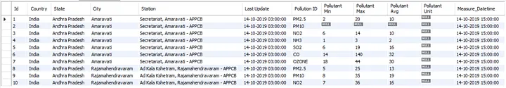
The good thing here for me is I can skip this step as I am collecting my data using an API. The data collected from the API are mostly in a cleaned format and you don’t have to spend time cleaning them. In my case, this is what my data looked like in the database:
As you can see in the image, this is a pretty cleaned version of the data and I can use this for Analysis and Visualization without any further changes.
But in general Data Cleaning is a very huge topic and it can completely vary on the type of data you are dealing with. You might have to do the cleaning while collecting the data, this type of cleaning will be done in the code, like in my Python code where I was collecting the Air Pollution data, I had to do a bit of Cleaning. I wanted to use this Data in Tableau for Data Visualization, but the name of a few states was not coming in the correct format, because of this Tableau will not understand the names of the states and hence will not plot the locations correctly in India’s Map. Eg: Andhra Pradesh was coming as Andhra_Pradesh so on, so I wrote a small piece of code for this:
#Replace with proper name.
rawData = rawData.replace(to_replace ="Andhra_Pradesh", value ="Andhra Pradesh")
rawData = rawData.replace(to_replace ="West_Bengal", value ="West Bengal")
rawData = rawData.replace(to_replace ="Uttar_Pradesh", value ="Uttar Pradesh")
Similarly, you might have to do the cleaning according to your data in the code itself.
If it is not possible to do the cleaning of the data in the source code, you might have to do this afterward at the time of querying the data from the database.
** This is an affiliate link, meaning if you enroll in any course on Udacity using my URL, I will get a referral bonus.
Result: The Cleaned Data For Analysis
After putting in all this effort, you get the cleaned version of your data for your analysis. Voila!!! I started collecting this data on 14th Oct 2019, but for a few days the data was not collected properly and there were few hours of data missing. I continued this collection of the data till September end 2020. In this period I collected a little over 10 million rows of data. I have published that data on the Kaggle Dataset for people to use and do the analysis. This dataset in CSV format was taking up around 1.2 GB, but I also created a .hyper extract (the Tableau data format) which was only about 122 MB files. I have uploaded the CSV and the Hyper file on the Kaggle Dataset website and you can download the same from here:
This dataset can be used to analyze a lot of things like:
How does the time period burning of crops by Haryana and Punjab Farmers affect air pollution?
Affect of festivals like Diwali and Dussehra on the air pollution level.
Is the pollution level less in winter months like January and February compared to November and December?
What was the effect of the Pandemic on the air pollution levels across India? ( This decreased drastically, we all know that but the detailed data will give you the exact picture.)
Step 4: Data Analysis
Now we have the cleaned version of the data, I have provided the link to the CSV format and the Hyper format of the data. Now I will suggest you guys use this data to extract some insight from the data using the tools of your choice, it can be Excel, Python, Tableau, or any other tool. Being a Data Analyst the end goal is to solve the business problem, tools are just a medium to reach the destination.
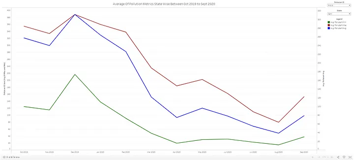
For reference, let me show you a quick tableau Dashboard I built:
Now I built this Dashboard in 4–5 minutes and a few quick insights that I can derive from this visual are:
The average PM 2.5 level in Delhi dropped from 388 in December 2020 to 74.6 in April 2020.
After major Unlocks in Delhi in August, the PM 2.5 level can be seen increasing significantly.
There was no major effect of lockdown on pollutant metric Ozone as the highest average value can be seen in May 2020. So we will need to dig deeper to find the variables having a good correlation with Ozone pollutant id.
There is other information as well that can be drawn from the visual and a much better and more informative Dashboard can be built using this data. I will leave that for you guys to brainstorm and come up with something better.